Abiko Free Press
Circa 2012
The content below is from the site's 2012 archived pages.
So give us time.
We started up in January, 2012. On March 9th, we published the collection of essays, "Reconstructing 3/11 ", on Amazon as an eBook. Amazon takes 30 percent of the royalties. Under the Abiko Free Press model, the remaining 70 percent is split equally between those who worked on the project. In this case, nine writers and three editors will each take one-twelfth of the income from "Reconstructing 3/11". And most of the book's authors are giving their cut to charity.
Will this be the model for future projects? Possibly. According to Alan Sheinwald, it may be inevitable. He sees two factors working together to make digital publishing the preferred method of distribution in the very near future. And Alan puts his money where his mouth is. If you're wondering if this is a current reality for us, it depends on the project, and how we get the book to market. It might be via Amazon or one of the other growing book retailers. It might be via Lightning Source or another printer with distribution to bookstores. Or by selling PDFs from this blog directly to the reader. We're not sure yet.
But you can be sure that the author is at the center of the show. So what does the Abiko Free Press do then, exactly? "What exactly" is we edit, we format, we do the PR and distribution (hint - that's really easy on the internet these days). And we do the cover design and all the intangible, necessary, nit-picky stuff that makes a book a book and not an extended rant on a blog.
And if we can't do it, we'll learn how to do it, or find someone who can do it. Because this is a labor of both love and practicality.
And over time, we'll get better and better while we build a catalog of quality, cutting edge fiction and non-fiction about Japan. The kind of catalog that we hope readers will find consistently excellent, and essential reading for anyone with an interest in modern Japan and good writing.
That's our goal.
![]()
+++
Wednesday, May 16, 2012
A Self-Publisher's Declaration of Independence
Take control of your own destiny. We the people are creative, it's in our nature, we hold this truth to be self-evident, but what we lack is discipline. Find that discipline to take our own writing seriously. Once we do this, the rest is just details. "I don't want to be involved in PR, I don't want to think about how to get my book into the hands of the reader, I'll only self-publish to get noticed by a real publisher." Stop it. Wipe your nose and dry the backs of your ears. Understand one thing: we are all real publishers. In the digital age, we all have the technology to write, distribute and promote our work. If our dream is to write, then write. If what we write isn't worth publishing, then we must learn the craft, and make it worth publishing. Only we ourselves can do that. Leaving our dreams in the hands of others is just laziness or cowardice. We cannot allow either to enslave us.
Do not confuse books with the publishing industry. Books matter. Books are a conversation between writer and reader about our civilisation; books record, mirror and in the best cases, challenge what we know. Books are sacred creations. Each represents a piece of knowledge that will outlast us when we are gone; it's our shot at immortality; not the superficial immortality of fame or notoriety, but that of discovering a universal human truth: this is what it is like to be alive; this is what we have learnt; this is what we bequeath to the future; this matters. The publishing industry? Who cares about that?
Ebooks are not just the future, they are the present. And this is our moment, right now. As long as the Big Six publishing houses still cling to their outdated business models of promoting paper products over ebooks, they are stuck with a byzantine system that is creaking under the unmet demands of the readers and writers. Meanwhile, ebooks are gaining ground. Now is the time to write, publish and define what's possible.
Ebooks are forever. A well-made paper book is a thing of beauty. But beauty is fleeting. Far from being something permanent, like all physical things, the paper book fades and dies over time. An ebook exists forever. It may be virtual, but it's very real and very permanent. And, by the way, paper mills are not things of beauty, or better for the environment, or use less energy than an ebook. But let's not sweat the details when there are principles to be affirmed...
Ebooks are democracy in action. There are no publishing gatekeepers or massive outlays of cash barring access to book creation. What determines success is up to "us" not "them". Publishing is too important a matter to be left to the experts. Writers are readers and readers are writers. As publishing has become accessible to all, the act of writing a book is not some rare act by a member of a tiny elite, but something that is within every literate person's ability. And more than that: it is our right to publish.
With the right to publish comes responsibility. Writing is a craft. Learn the craft because the reader deserves respect. A book, even an ebook, is not the same as writing a throwaway blog post. If the book is to maintain its importance to humanity, it must be more than a rant, more than a blatant attempt at self-promotion. A book, yes, even an ebook, requires that intangible something of lasting value. And there's no better way to finding that value than with a well-edited, well-designed and dare we say it, well-promoted book. But self-publishing does not mean you should do it all by yourself. It must be a communal effort to succeed.
The traditionalists will sneer, let them. Democratic publishing is revolutionary and the old guard will throw everything they have at ebooks and self-publishers as we grow in power. The attacks are along familiar ground that is getting shakier every day as it becomes clearer they are self-serving barbs from monopolists bitter that writer and reader have escaped their stranglehold: ebooks are not real books, they will whine (paper is real and digital is not?); the decline of the bookstore means the decline of books and reading (not so, we have never had as good a selection or read as much since the advent of the internet); and it's all the fault of Amazon! Attributing all the woes of the monopolists to Amazon is like blaming Ford for the end of the horse and trap. The old guard are still in the driving seat with their dominance of old media, but as people come to understand what we are capable of doing by ourselves with the tools we have right now, the appeal of the legacy publishers will decline to just one: that of the snob. They must adapt, or die. That is their problem.
Ours is to define the future.
This declaration originally appeared in an article by Our Man in Abiko for Tsuki Magazine's
As a writer, getting your work out there to a wide audience can be a tough slog. I have watched my partner facing the same uphill battle, trying to find the right audience for their stories. The writing part is pure joy, but the selling? That's a different story. It's kind of like those classic movie posters I've seen tucked away in old cinemas. They possess inherent value, yet finding the right collector who appreciates their worth can be challenging. For every successful writer or poster enthusiast, there are dozens struggling to make ends meet. Fortunately, I can support us with my work as a wardrobe director for a film studio, which has led to consulting opportunities with ad agencies. One such gig involved styling for a winter fashion shoot. The project's highlight was selecting the perfect winter ensemble for the lead actor. I remembered a vibrant pink ski jacket I had, which we paired with eclectic mittens and a scarf. The result? A cinematic masterpiece. The shoot was a success, and those visuals are now making waves across magazines and digital platforms. I eagerly await the day I can exclaim: Success!! - all in capitals.
2013 Blog Posts
Tuesday, September 3, 2013
The Golden Gatekeeper

Photo by Ben Simmons
What’s it like to have your debut novel, a Japan-themed thriller, published by a Big Six New York Publisher and then to have it optioned by one of the biggest names in the movie biz? The hell I’d know. But I am lucky enough to still be on speaking terms with someone who does. Meet Barry Lancet, whose book Japantown hits the shelves today. My review of it is here, but read on to find out what Barry has to say about it all…
Patrick Sherriff: First off, and there is a question coming, I promise, I really enjoyedJapantown. I started reading it with a writerly eye: watching the craft—trying to pick apart how you had stitched the whole together. But once preliminaries were over—introducing a sympathetic hero single dad, the mystery kanji, not to mention a public slaughter of a Japanese family in San Francisco, you had me hooked. Pages were flying by and I was just reading to find out what happened next, damn you. This is your first novel, but it's a highly polished debut if I may say so. How long did it take you to write, and did you really write much of it wedged between Tokyo's commuters? Any hairy moments in the writing process (other than the trains)?
Barry Lancet: Happy to hear you enjoyed Japantown and were hooked by the story in spite of your best intentions! I don’t know how much time it took me to write because it was stop and go until I made up my mind to get it done, and get it done exactly as I imagined it.
But it was years, not months, because I worked for a Japanese company at least six days a week. So I salvaged every available moment to write. And that included standing-room-only time during the commute with a clipboard in hand.
Of course, I refined the material that emerged from those train sessions. The second book was finished in a matter of months, happily with no train time. I’m sure Japan Rail’s revenues dropped precipitously.
Never underestimate a man with a clipboard. You've spent a career in publishing as a book editor, how's the view from the other side of the desk?
I’m enjoying it on two levels, as an author and as a former editor. Everyone I’ve met or corresponded with at Simon & Schuster has been great. They are working on a much higher stage than I ever did. Some of what they are doing is the same. Quite a lot is different. I help when I can. Otherwise, I stay out of their way and just let them do what they are all good at!
Congratulations on being published by S&S. Tell me and my half-dozen readers a little about the process of catching the eye of a Big Six publisher.
 Whether it’s fiction or nonfiction, it’s about quality. For fiction, that means character and story. A Japanese editor who has crafted more than his share of bestsellers once told me that top-selling books have to deliver one-hundred-and-ten percent. Eighty, ninety, or a hundred percent won’t do it.
In other words, a writer has to go beyond what’s currently available. With few exceptions, I think this is true. So know the books in your field and reach farther.
Second, think about the agents’ and editors’ points of view. An agent will often look at 20 or more queries a week. An editor might accept four or five submissions a week to consider—after the books have been filtered through the agent system. Call it jaded, call it experience, call it what you will—but these are smart people who happen to love books. They are looking for something that excites them. Keep that in mind.
Third, after all the time you’ve spent writing your book, invest time on the single-page letter that will represent your effort. If you are planning to approach any serious American or European agent or publisher, my advice would be don’t even consider sending out your query letter until it’s gone through 10 serious rewrites. And then I would test it on small targets first.
The above advice has been earned. I banged on these doors for a long time. My position as an editor got me an extra thirty-seconds’ consideration in some places, but in the end it comes down to the manuscript.
Did you consider going the self-publishing route? You have the necessary skills after all. What are the advantages/disadvantages as you see it of either proposition. Would you ever self-pub or is that out of the question now your soul belongs to Simon and Schuster?
Self-publishing was at a much more primitive stage several years back when I might have gone that way. I did consider it, but after my final draft of Japantown I was convinced it was strong enough to attract a major publisher.
I’ve seen some excellent self-published books and believe self-publishing has its place and purpose. For example, and this is only one type, nonfiction books by someone who has his or her own business or teaching platform can work extremely well.
For fiction, over the last 15 months I’ve met three thriller writers who self-published, got some traction, then had their contracts picked up by a publisher. Two by Amazon.
For those going the self-publishing route, I’d advise keeping these points in mind: make sure you are putting your best effort out there before you publish, and be prepared to spend an extraordinary amount of time on marketing and PR work.
Will I self-pub in the future? You never know.
Fair enough. With the relative economic decline of Japan, has the world's readers' attention moved on to say, shock horror, China?
The West’s fascination with Japan has never been about Japan’s economic clout, even at the height of the country’s financial success. It’s always been about the culture, the tradition, and the people. The old and the new. People might come for business but they stay for everything else.
There is a lot else, for sure. What advice would you give writers eager to put their experiences of Japan onto the page? Should they embrace the tropes (Japan as mysterious-geisha-loving-ninja-geek-land) or reject them?
What Japan has going for it are a different lifestyle and a vibrant culture and aesthetic. Too many Asian countries wiped out their traditions for political or economic reasons. Japan has not.
The traditional and contemporary are in continual flux with each new generation, or half-generation. And there are the psychological aspects. I find all of this fascinating.
So I would say write about what intrigues you, or use Japan as a springboard to something larger as, say, Bruce Feiler did. Or consider your adopted Asian home as an inspiring place from which to write about whatever you choose.
What are your hopes for Japantown? You mentioned a sequel. Is that in the pipeline?
Even before Japantown sold, I’d already begun a second book with the same main character, Jim Brodie. I was having too much fun, so I couldn’t help but start the next one.
In a preliminary discussion with my future editor at Simon & Schuster, she asked about what I was working on next, and in the end the initial offer for one book evolved into two.
Her decision was a huge vote of confidence for which I’ll be eternally grateful. And then J. J. Abrams and his Bad Robot Productions came along and optioned the book. They too, like my editor and agent, “got it,” which I take to mean I must be doing something right. I expect there will be a lot of interesting conversations going forward.
Any plans to write about the Tohoku disasters? Or is Fukushima too thorny a subject even for protagonist Jim Brodie to tackle?
Jim Brodie tackles thorny subjects. Wait until the next book! In Japantown he grumbles about the tragically slow government response to the Kobe earthquake, for example. He mentions Fukushima in that context, and I imagine something more fully developed will eventually emerge.
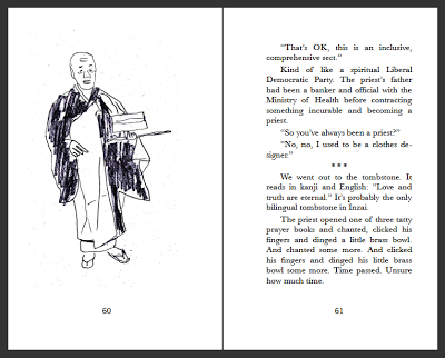
That said, there is a lot of good work being done on the subject, including yours, so I feel no urgency. If I tackle it, it’ll be from Brodie’s perspective. We haven’t argued about it yet, so that’s a promising sign. I lose most arguments.
Yeah, protagonists are like that. Don’t ever give them a Twitter feed, by the way, you’ll never win an argument again. How do you see the future of publishing?
That is a great question and one I’ve been wrestling with for the last five years. I can see a number of different paths it could take, but the truth is, no one really knows.
Publishing is in an extended transitional phase, extended being the key word. Books aren’t music, nor are they movies. The one thing I can say is that there are more options for writers than we had before, and that is a positive development.
Anything else while you have the floor?
I’d like to express my gratitude to all those who have shown interest in Japantown and Jim Brodie. I hope they have as much fun reading the book as I had writing it!
Barry can be found at his Facebook author page and on Twitter and his website is here.
Tuesday, March 19, 2013
Ningenkusai, our latest baby, is out on the streets
There has long been a veneer covering Japan, a protective barrier that for decades has given outsiders the impression that Japanese society is proudly homogeneous and bullet-proof to the kinds of economic and social problems routinely grappled with in the West. Things like poverty and homelessness, for example. However, the earthquake and nuclear melpown of March 11th, 2011, made the world acutely aware of just how flawed and unstable some Japanese social structures and government agencies can be.
But the aftermath of 3/11 has shown the outside world only the most obvious and recent cracks in Japan’s shiny, protective veneer. These cracks have existed for decades, in forgotten and shunned streets and neighborhoods in big cities like Tokyo. This story, Ningenkusai, is a brief pictorial account of disadvantaged men, some of them plagued by debt and alcoholism, who live in Sanya, a run-down district the Tokyo City Government does not even officially acknowledge. But this hard, sometimes seedy neighborhood does exist, and this is also the story of two foreign Christian missionaries who have been helping the men down in Sanya’s streets since the early 1980s.
This is Dan Ryan's first new piece of original photojournalism in 25 years and the Abiko Free Press is proud to publish the book as a 99-cent Kindle single, because we believe quality, independent journalism shouldn't be exclusive, expensive or inaccessible.
Monday, March 11, 2013
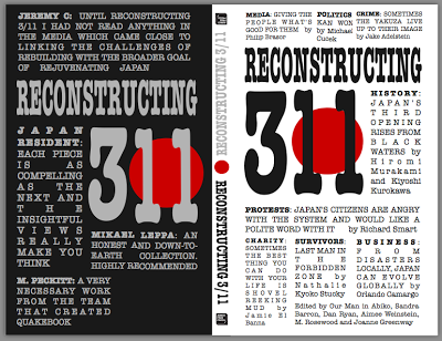
Reconstructing 3/11 free…and in print
They say in public relations you should never try to give two items of news at once. People will just remember one, forget the other or get the two confused.
Well, to hell with PR. We are making the radical assumption that you can handle two bits of news at once. Are you ready? Here is the first: To mark the second anniversary of the earthquake, tsunami and nuclear melpown of March 11th, 2011, the ebook Reconstructing 3/11 is free from now until March 14th. And tell a friend.
But that's not all. (This is clever PR speak to clue you in that there is a second item of news. And here it comes…
Reconstructing 3/11 is now a print book. What? Print is dead, they say. Well, long live print, we say. The paperback edition is available right now through CreateSpace.com just here and Amazon as soon as the data clears the Amazon servers, we estimate within a day or two, the timing is out of our hands. But the details aren't: It is a rather tasty pocket-sized 5" by 8" paperback printed on 192 pages of cream paper. Not bad for $9.99.
What is Reconstructing 3/11? Why, it is a thoughtful examination by an impressive list of noted and knowledgeable authors of the state of Japanese society one year after the devastating natural and man-made disasters of March 11th, 2011. But don't take our word for it, read the review in the Japan Times here. Or check out the reviews on the back cover of the print book.
So, you got that?
Sunday, March 10, 2013
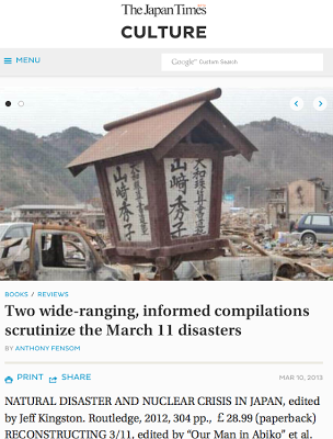
It gives us great pleasure to see our work getting some critical acclaim in the press. Heck, just to see anyone read our books gives Dan Ryan and me a kick. But to have our first-born mentioned in the same breath as Jeff Kingston's collection of pieces on the 2011 triple disaster of earthquake, tsunami and nuclear melpown, is, well… humbling. The Japan Times review by Anthony Fensom is reproduced here. And stand by, fellow Abiko Free Press fans, for some more Reconstructing 3/11news you can really use…
Two wide-ranging, informed compilations scrutinize the March 11 disasters
NATURAL DISASTER AND NUCLEAR CRISIS IN JAPAN, edited by Jeff Kingston. Routledge, 2012
RECONSTRUCTING 3/11, edited by “Our Man in Abiko” et al. Abiko Free Press, 2012
As Japan marks the second anniversary of the tragic March 11, 2011 “triple disasters,” the question remains: Did the crisis spark real reform, or has it simply been a return to business as usual?
The reformers have had much to say since that fateful Friday afternoon when a devastating earthquake and tsunami inflicted death and destruction on the Tohoku region as well as causing “Japan’s Chernobyl” at the Fukushima No. 1 nuclear power plant.
In assisting the recovery process, it is important to seek a variety of informed views and this is exactly what the editors of two noteworthy compilations have succeeded in doing.
“Natural Disaster and Nuclear Crisis in Japan,” edited by Japan Times contributor Jeff Kingston, a history professor at Temple University (Japan campus), explores everything from volunteerism to social media, energy policy, Japanese history and politics in its wide-ranging review.
This is a fairly scholarly read despite the editor’s instruction that contributors write in an “accessible style” with the aim of “more definitive reports in the future.”
While the arguments may be familiar, the Japanese and other writers in Kingston’s compilation make some important contributions to the debate, which has obvious international implications.
The first lesson is the need for disaster resilience rather than trying to eliminate risk. Strict building codes, regular emergency drills and other disaster preparations saved numerous lives, but the authors also suggest improving land zoning and evacuation systems, rather than building massive seawalls that can induce complacency.
Another issue is the impact of cascading disasters, considering that Japan’s initial quake-induced blackout affected tsunami warning systems. The demographics of a particular area should also be factored into planning, given that two-thirds of those drowned were aged 65 years and above.
Communication and leadership were seen lacking during Japan’s biggest peacetime disaster. The so-called nuclear village is severely criticized over its tactics to induce public support for plant sites, a lack of transparency during the crisis and the “moral hazard” of having the industry’s safety agency sited within the pro-nuclear economy ministry.
The mainstream media also comes under fire for its lack of scrutiny. Symbolic of close media-industry ties was the fact that, on the fateful day, the chairman of Tokyo Electric Power Co. (Tepco), operator of the stricken Fukushima nuclear plant, was reportedly in China with a group of journalists, while it was some time before the Japanese media admitted a melpown had indeed occurred.
The role of nongovernmental organizations in the disaster recovery effort is also examined, with one author criticizing reports for implying that “everyone local was a passive victim, devoid of any subjectivity, waiting to be saved.”
Continuing the same themes, “Reconstructing 3/11″ also makes some telling arguments, in a more journalistic style as reflected by the contributors.
Another compilation from the British blogger in Japan known as “Our Man in Abiko,” this work uncovers some intriguing stories, ranging from the yakuza‘s role in disaster assistance to the last man left in the “forbidden zone” and the work of volunteer groups such as It’s Not Just Mud.
Contributors Hiromi Murakami and Kiyoshi Kurokawa call for a “third opening” of Japan, following those forced by the Black Ships prior to the Meiji Restoration and the Allied Occupation post-1945. This time though, they assert the nation needs a “civil-sector-driven, bottom-up transformation.”
Critics may condemn such compilations as simply more Monday morning quarterbacking, written post-event by those seeking to push a particular cause. However, this would be doing a disservice to all involved, many of whom have a personal stake in the recovery process.
The fact that two years after the event some 300,000 people are still living as evacuees and only a quarter of homes targeted for decontamination have been cleaned shows the crisis is far from over. Meanwhile, the debate continues over nuclear energy, with nearly all the nation’s reactors still offline.
Writing in April 2011, U.S. historian John Dower is quoted describing the short window of opportunity the disaster afforded to policymakers:
“There is a moment in the history of a nation or of a society to suddenly realize what is important after a sudden accident or disaster. There emerges a space to rethink everything … But if you do not hurry, that space closes quickly.”
For Japan’s reformers, preventing another catastrophic disaster may require seizing that space, and quickly.
Anthony Fensom is a freelance writer and communications consultant.
Posted by Our Man in Abiko
Saturday, March 2, 2013
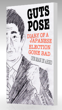
Guts Pose now available in print
I'm pleased to announce that our very first print book is available. Guts Pose: Diary of a Japanese election gone bad is now no longer just a virtual book but a rather tasty 218-page 5" by 8" paperback, lovingly crafted in an easily readable font (15 point Baskerville) and features 20 original pen and pencil sketches by the author, at least half of which have never been published before, on paper or screen.
Guts Pose tells the story of the landslide that swept Shinzo Abe to power as Japan's prime minister, despite him being reviled by most voters, from the perspective of a disenfranchised foreigner trying to get to grips with life in Japan, let alone the intricacies of a political system at times as inscrutable as his mother-in-law.
It's currently available for order from Create Space at $8.99 right now and will be on sale from Amazon within a week. The digital version is on sale as a Kindle book for $4.99.
I'm very happy with the way it's turned out, and I can't wait to apply what we learnt making it to our next projects too. See for yourself:
Posted by Our Man in Abiko
Saturday, January 5, 2013
Happy New Year from the Abiko Free Press
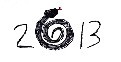
Just a quick note to wish all a happy Year of the Snake and to fill you in on what we have planned.
We've got a number of cool projects coiled in the dark that will spring into life this year. You can expect a couple of books from Dan Ryan related to his month in 2012 of prowling the mean streets of downtown Tokyo, which we have code-named Tokyo Panic Stories, a collection of his short stories, and a collection of essays by our Man in Abiko, not to mention his second novel, before the year is out. And those are just our pet projects. We expect to add more names to the Abiko Free Press nest this year too.
And if growing our catalogue wasn't enough to keep us busy, we also plan to publish our first print books, improve our formatting, editing and cover artistry skills, and even venture outside the confines of the mighty Amazon.
Plenty for us to sink our fangs into. And you too.
Posted by Our Man in Abiko
Friday, December 21, 2012
Guts Pose: Diary of a Japanese election gone bad on sale now
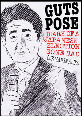
We are proud to announce the publication of our sixth book, Guts Pose: Diary of a Japanese election gone bad by Our Man in Abiko, which chronicles the least anticipated, most uninspiring Japanese campaign since the war, that somehow created the biggest landslide victory in recent times for the most hated party of recent times. But more than that, the diary is a daily slice of life of a foreigner living in Japan trying to learn the ropes and make sense not only of his corner of the world, but also why his dead father-in-law's TV wakes him up at 7am.
Based on his Japan Election 2012 Diary live blog, Guts Pose features a previously unpublished afterword by Our Man and foreword by Michael Cucek, MIT research associate and renowned blogger on Japanese politics.
"I can easily say that with my current life completely focussed on such issues, Our Man's blog has become far and away the most important insight for me into this election over trillions of supposedly well-informed other sources. I'm now checking for it daily."—Craig Scanlan
Where you can buy Guts Pose: Diary of a Japanese Election?
Update: Amazon says: Out of Print--Limited Availability.